 FAKE RONJAN!!
Useless ______ Analysis!
March is upon us, and we are coming up on the two-year anniversary of the founding of this site! We've tried some wacky stuff, and we want to do more. What does this mean?
As of today, Useless Sports Analysis is now Useless Analysis!
That's right -- we are broadening our scope to take on whatever the heck we feel like! I expect that we will largely continue to be sports-focused, but anytime a crazy idea pops into our head that's not sports-related, we'll go ahead and give it a shot.
In that vein, I took a stab at some perceptual mapping in politics. (Don't worry -- we're not being inflammatory here, this analysis is neutral!) I wanted to stretch some of my advanced analytics muscles that haven't been used since my first job out of college.
Public Policy Polling conducted a poll of Republican primary voters and released the full crosstabs here. There are some very interesting splits in here, particularly when we look at policy positions for voters who support particular candidates.
Enter the wacky idea: look at how voters that are favorable to different candidates respond to different questions, such as their take on global warming, evolution, Benjamin Netanyahu, or the Tea Party. Then, based on these responses, visually plot candidates close to the positions that the voters think they stand for.
(Nerd alert: I created a Principal Component Analysis biplot of the contingency table of the original crosstab data.)
Here's what that data-driven analysis came up with:
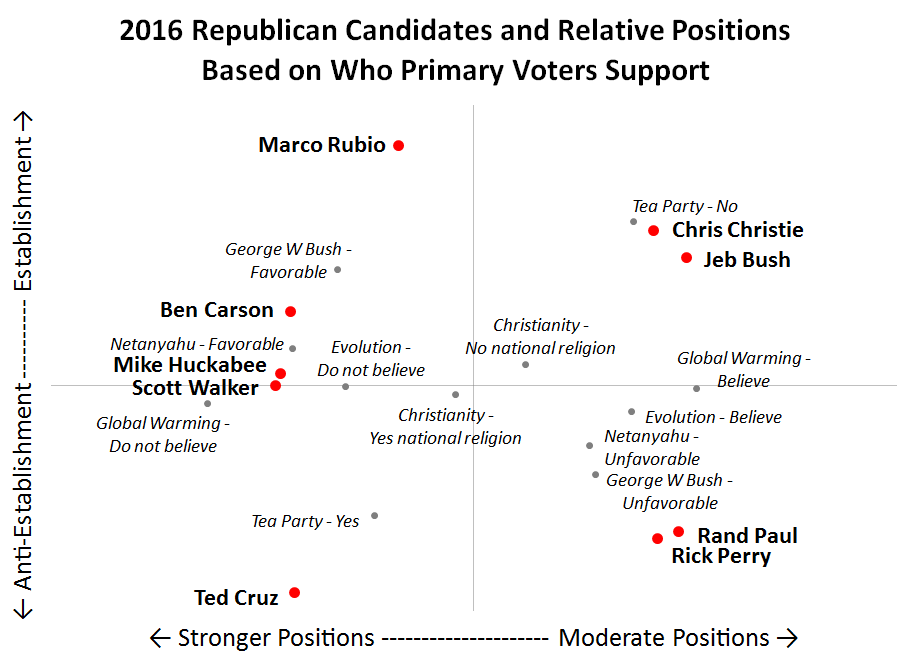
How to read this chart:
- Candidates are marked with red dots, while different positions are marked with gray dots
- The closer a candidate is to a position, the more that voters associate that candidate with that position
- The closer a candidate is to another candidate, the more similar that voters feel they are
- The further a candidate or position is from the center, the more that candidate or position differentiates
The most interesting thing to me is how the two axes ended up being created. Principal Component Analysis does not accept manual intervention -- I didn't tell the computer to plot candidate establishment vs. candidate position strength. This was generated organically by how the candidates and positions differentiate themselves, and I named the axes as best as I could based on where things landed.
What we end up with is establishment candidates at the top of the chart and challenger candidates at the bottom, and strong policy positions on the left and more moderate policy positions on the right.
I don't have any commentary on this chart (that I'm willing to post on this site right now!), but I thought the exercise itself was fun and a nice way to kick off the new, broader site.
Thoughts?
-rj